The Survey module is useful for learning more about your clients' opinions, needs and interests. Concretely, you create a survey that contains pages and questions in which you can add validators and comments without necessarily having programming experience. However, if you have programming skills, you can go further with the potential of the survey. Once created, the survey can be shared with a link. If you integrate this link in a communication sent to your contacts using DI, the collected data will be added to your contacts' profiles in your DI project.
Access path: Audience → Survey |
Step 1: Configure the Survey
After generating a survey (click Add a new survey), you must configure some options depending on your use:
| Nom | The name is for administrative purposes only. |
| Category | You can create survey categories in the Configuration section (left menu). If you haven't created any category, the only choice you have is Default category (a category that you can change the name in the Configuration section). |
| Languages | If you use the interface in English, the default language for the survey edition will be English and the preview. To change the default language or a language, use the + button next to English. This function simplifies management by compiling multilingual survey data in a single database. The system provides a separate link for each added language while keeping the same structure for both languages. The code for the added language must use the format Language-Country. For example, to add Canadian French, you would use fr-CA. To delete a language, check Delete culture and save the changes. |
| Title Description | The survey title is displayed at the top of each page, and the description below the title, as additional info in a different font. Remember to add the title and description in other languages if it applies. Click the pen to edit style (size, font, alignment, etc.). |
| Template | The template allows to define the visual presentation of the survey (images, colors, fonts, etc.). If you want a custom template for your specific needs, contact your account director. If you don't have a custom template for your account, you can choose among the 4 default templates provided by Dialog Insight:
Le template #2 has some modification options for the styles (at the bottom of the page in the Template customization section). The other templates cannot be modified. |
| Numbering | This function can be used to define which type of numbering applies to the pages and questions. You can specify which pages you want to apply the numbering using the dropdown menu. |
| Progress bar |
|
| URL Header image | You can indicate the link to your company's logo or another image to add it to the survey's header. |
Accessibility allows us to determine whether you want a survey link that is the same for everyone or personalized to the respondent in order to recognize and compile data on this contact.
Anonymous, accessible from a public link
Access method that collects responses anonymously. The survey link is the same for everyone.If the respondent leaves the survey before finishing it, the respondent must restart from the beginning.

- Invitation, accessible by a personalized link
Access method that obtains answers by automatically collecting the first name, last name and email of the respondent. The survey link is personalized for each recipient and must be sent within a communication (e.g. an email) from the platform. This method also allows you to target respondents who have not started or not yet completed the survey and send them a reminder.If the respondent leaves the survey before finishing it, the respondent can return to it using the link received and continue to the question page where he exited.
Number of allowed answers:- Choose One only so that the respondent can only answer once for the duration of the survey.
- Choose Once per communication so the respondent can answer the same poll several times for each communication received. This option is useful when you want, for example, to send a recurring satisfaction survey. The answers are then compiled in the same survey.
- Private, accessible from a PIN or password
Access method that is only available with a PIN or a combination of PIN and password, which are provided in advance to the respondent. The survey link is the same for everyone and the first page of the survey will ask you to enter a PIN or the combination of PIN & password. This method is used when the access to a survey is sent by traditional post, and can later be accessed by the respondent. If the respondent leaves the survey before finishing it, he/she can return to it from the link received and continue to the question page where he/she exited.
Navigation
In this section, you can add a Previous button. If the template has page numbering, you can use the Direct navigation page option. This allows the respondent to go to a page without following the normal progression. Thus, someone could visit page 4 and 5 before answering any question.
Exit options
To add a redirection to a web page (e.g. your website) when the survey is submitted.
→ Defining Survey Parameters
Step 2: Add Pages
You must first add pages which will be used to contain the survey elements (questions, validators and comments). To add a page, click Page:
You must then indicate the type of page among these options:
- Introduction (optional): First page to display. If there is no introduction, the first question page will show up instead.
- Questions: Page that contains questions, validators and comments.
- Text only: Page for explanations or precisions.
- Conclusion: Last page to display when all required questions have been successfully answered.
Step 3: Add Content
Among the different content types, you must, at minimum, add questions. Otherwise, it wouldn't be a survey! ;)
| Position | The Question Editor lets you choose the position of any question within the questionnaire. Use the dropdown menu to choose from available positions. |
| Statement (Question) | Each question includes a statement which appears in the questionnaire and a summary for administrative purposes in Contact. This summary is used when exporting the file. When entering the statement, the application automatically generates an editable summary. |
| Complementary comment | The complementary comment is optional and is displayed in a different manner in the questionnaire. It is used to clarify a question. |
| Help message | Le message d’aide est une note, optionnelle, qui s’affiche à l'endroit désiré pour aider le répondant. Help messages are notes to help respondents. They may be placed wherever they are needed |
| Summary | Description for administrative purposes. The respondent doesn't see this text. |
| Matrix of questions | The sub-question matrix links a series of questions to one answer in table format. This option requires the addition of sub-question lines. Multiple choice answers (e.g., ranging from “unsatisfied” to "very satisfied") appear in the table lines. Each added line is a self-contained question with its own statement, complementary comment, help message, summary, and condition. Lines may be randomly displayed in the table. |
| Question types |
|
Answer Choices
Several question types require that you add answer choices. To add an answer option, click on the Add a choice button. A window appears in which you enter the label (displayed to the respondent), complementary comment, help message, summary (for administrative purposes), value (content in the database), and condition.
For each choice, you may request further information (more questions). In some cases you may specify display options: number of columns, horizontal or vertical, or random arrangement of questions.
Advanced Options | |
| Layout | The layout options modify question type and appearance (radio button, text box, etc.). You may specify a CSS class or enter styles directly in the CSS Styles field. For text boxes with several lines, use the width field. |
| Condition | Adding conditions to a question defines, among other things, that a question is mandatory based on the respondent's choice. Condition commands are available on request. Conditions are used to display a question according to an answer obtained previously. The addition of conditions is available when editing the statement of the question. Example Question 1: What age range are you? Answers: 18-25, 26-35, 36-45. Question 2: Are you planning to buy...( This question can only be displayed if the respondent chose the age range 18-25) For more details, see Adding a Condition to a Survey Question. |
| Customized Error Messages | Generic error messages are automatically created with each survey. Advanced options may add customized messages to each question. It is possible to add information not displayed in the generic messages. |
| Validation option on a specification | This option allows to require an answer to a question even if a specification has been added, without setting the question as “Required”. This forces then to consider the specification in the results. The option is available only for the Question types Checkboxes and Radio button. |
| Validation option or condition on a Specification field | This option allows to achieve validations or conditions on a specification field. To do so, you have to go in the question editor and enter your conditions and validators as usual. |
The Comment button adds text between 2 questions. The name is only for administrative purposes and defines the questionnaire's structure. Each text corresponds to specific content in the questionnaire. The complementary text provides additional information about specific content and is displayed in a different format in the questionnaire.
| Page | This function lets you to choose on which page you want to add a validator. |
| Statement | When clicking on the little yellow star at the right of the box, you will see the following functions: When: This function allows you to choose the page or the condition to which you want to add a statement. Operator: This function defines the operation that you want to apply to the page or the condition that you chose:
|
| Summary | The summary is the name that you want to give to the validator. |
| When the statement is true or false | |
| Status |
|
| Display a message | If you check this box, the following options appear:
|
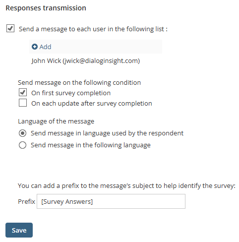
Step 4: Link the Answers to the Contacts' Profile
The strength of DI surveys is that you can collect or update data of your contacts. To use this benefit, you must link the answers to the project's fields.
→ Updating Profiles With Survey Answers
Step 5: Review and Translate the Survey
If you want to include a French version of the survey, you can translate it in the Revision section. When the translation is done, review the content. In the Publish section, click the lens in the upper right to preview the survey.
→ Reviewing and translating the content of the survey.
Step 6: Publish the Survey
When the survey is ready, it is time to share it with your contacts.