An opt-in workflow is configured by default in the Opt-in module. You must customize the elements of this workflow to adapt them to your case and goals. The workflow includes an entry point (a link) that you integrate into a message or an interceptor, the form itself, a confirmation page and a welcome email (optional).
Access Path: Acquisitions -> Forms → Opt-in |
Requirements
Step 1: Generate the Workflow
Go to Acquisitions -> Forms → Opt-in and click Create an opt-in form. Then, select Select Hosted by Dialog Insight and indicate the language of the form:
| If you have a CDP structure, an opt-in form can only be created in a secondary project (contact data acquisition is not possible in the unified project). Make sure to create the form in the secondary project which contains the list of contacts who are concerned by the form. |
Step 2: Edit the Form
Double-click the opt-in form: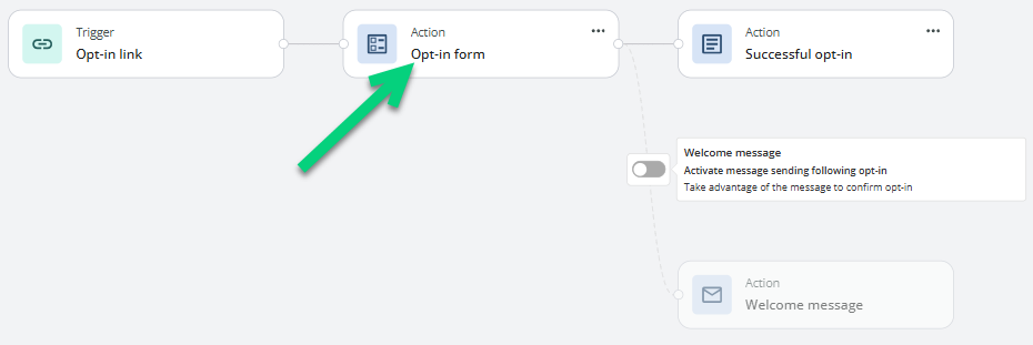
A form template is offered by default to help you with the editing. This template comes with predefined fields and texts. You must, however, adjust the template form to your goals. If you want to retrieve more information than the one presented in the template, you must do so from the Form configuration page (see step 3 for more details).
☑ Header and footer
You can add content to the header and footer (your logo, a description, a title, contact details). You must first add a structure block into which you drag a content block. Modifications will apply to all the pages of the workflow.
☑ Global configurations (global styles)
You can modify styles for all pages of the workflow. However, if styles are applied to a specific element, this style will prevail for that element and replace the global one.
| Section | Description |
|---|---|
| Content | Styles for texts and links, such as font, size, color, weight, etc. |
| Pages | Styles for the entire page, such as top and bottom spacing, background image and color. |
| Advanced options | CSS and favicon. |
☑ Form styles
In the main section of the form, modify the colors, widths and fonts of the elements (fields, buttons, texts):
☑ Adding content
The form template comes with only one column that includes predefined sections for the header, the form and the footer. You can add a zone by dragging a structure block (columns) in which you drag content blocks. Editing works the same way as the email editor. The available content elements can be inserted in any section except the section for the form itself (the inputs). In the next step, we will see how to edit or add new fields.
| Text |
| ||||||||||||
| Image | Element that lets you add an image. It can be used to insert your company's logo or an image related to the subscription. In addition to adding an image, you can define its width, alternate text to be displayed when images are not shown, and, if needed, a redirection link to a page to show when the image is clicked. You can also choose an image that is not yet hosted by clicking Upload an image. ** PNG, GIF and JPG images are best. Make sure the image dimensions fit. If needed, you can edit your image before inserting it in the message (or form) by clicking on the edit icon
| ||||||||||||
| Divider | Element that adds a horizontal line, mostly used to separate sections.
| ||||||||||||
| Button | Element that adds a call-to-action button, which redirects the visitor to a new page.
| ||||||||||||
| Form | This area displays the input fields used to collect information on the people who wish to subscribe to communications. Some fields are already included in the form template, mostly those part of the primary key, which cannot be edited nor deleted as they are required for contact identification in Dialog Insight. **There can only be one input area per form. | ||||||||||||
| Social media follow | Element that lets you add links to your social media pages (icons and related links). The provided images cannot be changed. However, you can choose however which one to display and the text and link for each.
|

 . The image editor will open to let you re-size, crop or make any other necessary changes. If you have a lot of images and have created categories to group them, select in the
  .
. to open the image editor.
| Important: The consent request must include the name of the enterprise, the postal address and either the phone number, the email address or the website address. Conditions of the opt-in must be displayed mentionning the person can opt-out. |
Step 3: Configure the Fields
☑ Profile update method
In Form configuration, under Profile update, select the profile update method for the contacts. As the information provided in the opt-in form can be different from the information already in Dialog Insight when the contact already exists in your contact list, it is important to specify how you want them to be processed.
☑ Default fields
In the Form configuration section, you can modify the fields from the default template. First, check if these default fields fit your needs, particularly those related to opt-in. You can add new fields depending on the data you want to collect on the people who subscribe to your communications. You can remove fields you don't need. Note that it is impossible to delete fields that are part of the primary key, as this information identifies contacts in the application. Data entered in one of the form inputs will be added to a project field. If you modified a field from a published form, you must update the opt-in workflow to apply these changes.
The opt-in fields are displayed with a checkbox. You could remove the checkbox and put a "transparent" opt-in by selecting Hidden field:
The person who submits the form will automatically be subscribed. Thus, it is important to explain with a text that submitting the form gives consent to opt-in.
| Field | Description |
|---|---|
| Section | The form has only one section by default. If you created another section, you will then have the option here. |
| Field | Name of the selected field. It can be a field from the project or a field specific to the form. |
| Label | Name of the field as it should display on the form. If multiple languages are offered, you will need to specify a label for each language. **Warning - If a label is not provided for each available language, the default language label will be used. |
| Source | Indicates where the field comes from. There are 3 possibilities:
|
| Type | Available only when the field value comes from the form. Field used to define the type of value can be inserted in the field. Any data entered in the field that does not correspond to the indicated type will trigger an error. The available field types are:
|
| Options | Available only when the field value comes from the form.
|
| Maximum length | Available only when the field value comes from the form. The length of the value in number of characters, only for text fields. |
| Default value | Available only when the field value comes from the form. Default value to assign to a REQUIRED field if no value is provided. If a default value is provided for a required field, the contact will be added even if no value was provided. |
 .
.☑ Field labeld layout
Under the Form options tab, define how you want field labels to display, either on the left, right or inside of the input area.
☑ Authentication process
If you want to be sure that the person who fills the form is a real person, it is recommended that you enable the reCAPTCHA option so that a validation question is added to the form.
If the registration form is displayed under a domain name other than ofsys.com, you will first need to register the domain used on reCAPTCHA to get your private and public keys. To register your site or domain with reCAPTCHA, go to https://www.google.com/recaptcha/admin#list and follow the instructions provided. Once saved, reCAPTCHA will give you private and public keys that you'll need to enter in Dialog Insight.
To enable the authentication option:
- Check the Use Google Recaptcha option.
- Click Manage keys.
- Choose your domain, if already configured. If not, click Add a key to register your domain name or the page to display the registration form, and specify the public and private keys that were assigned by reCAPTCHA when opening an account.
Step 4: Edit the Confirmation Page
After submitting a form, we are redirected to a confirmation page. Edit the text and the visual to adapt it to your brand and use case: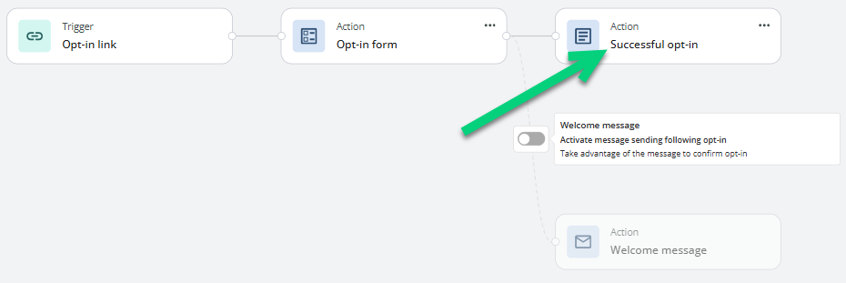
Step 5: Add a Confirmation Email (optional)
You can add a welcome message that is sent automatically when the form is submitted. It is a useful tool if you have relevant additional infos. Avoid repeating the content of the confirmation page.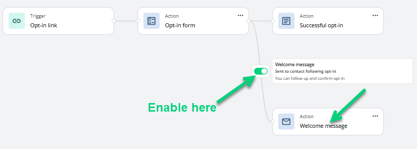
Step 6: Publish the Form
Before publishing, verify the rendering by clicking Preview in the upper right of the form edition. After the validation, you can publish the form.
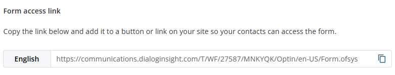
Step 7: Embed the Form
When the workflow is all set, all you have to do is copy the form link displayed under Forms access links and paste it in a message (e.g. in a button) or in an interceptor: